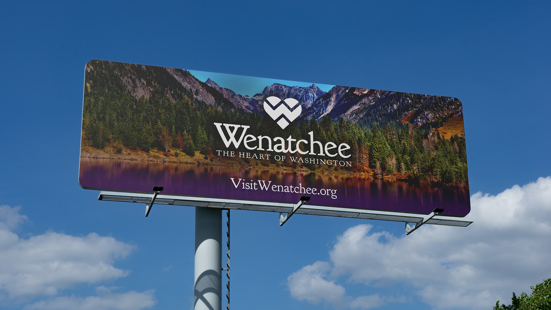
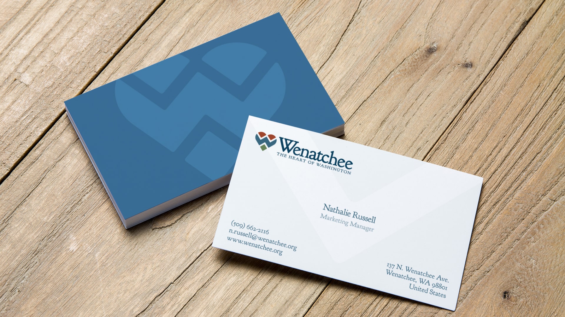
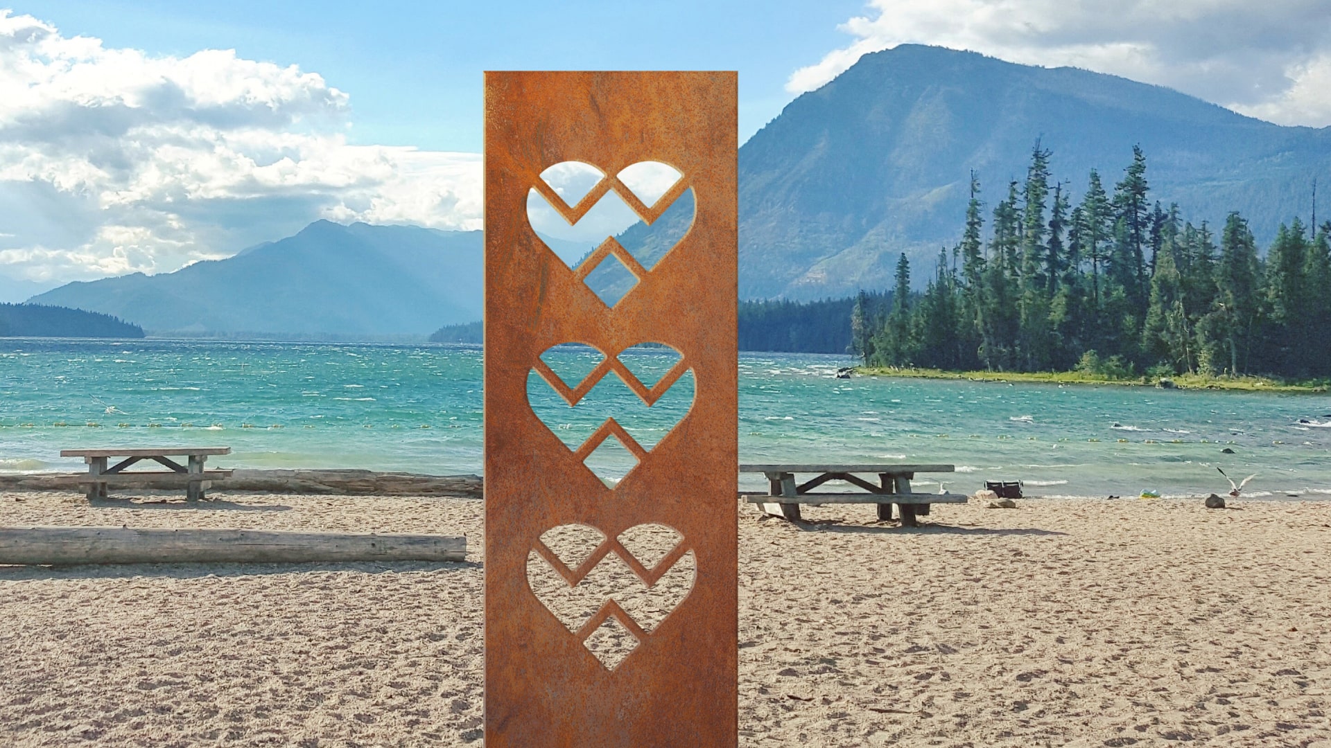
Visit Wenatchee
The Challenge
The Wenatchee Valley Chamber of Commerce team was in search of a brand logo and tagline that was instantly memorable to promote the region as a renowned destination for outdoor recreation, diverse naturaly beauty, and exciting dining experiences.
The Solution
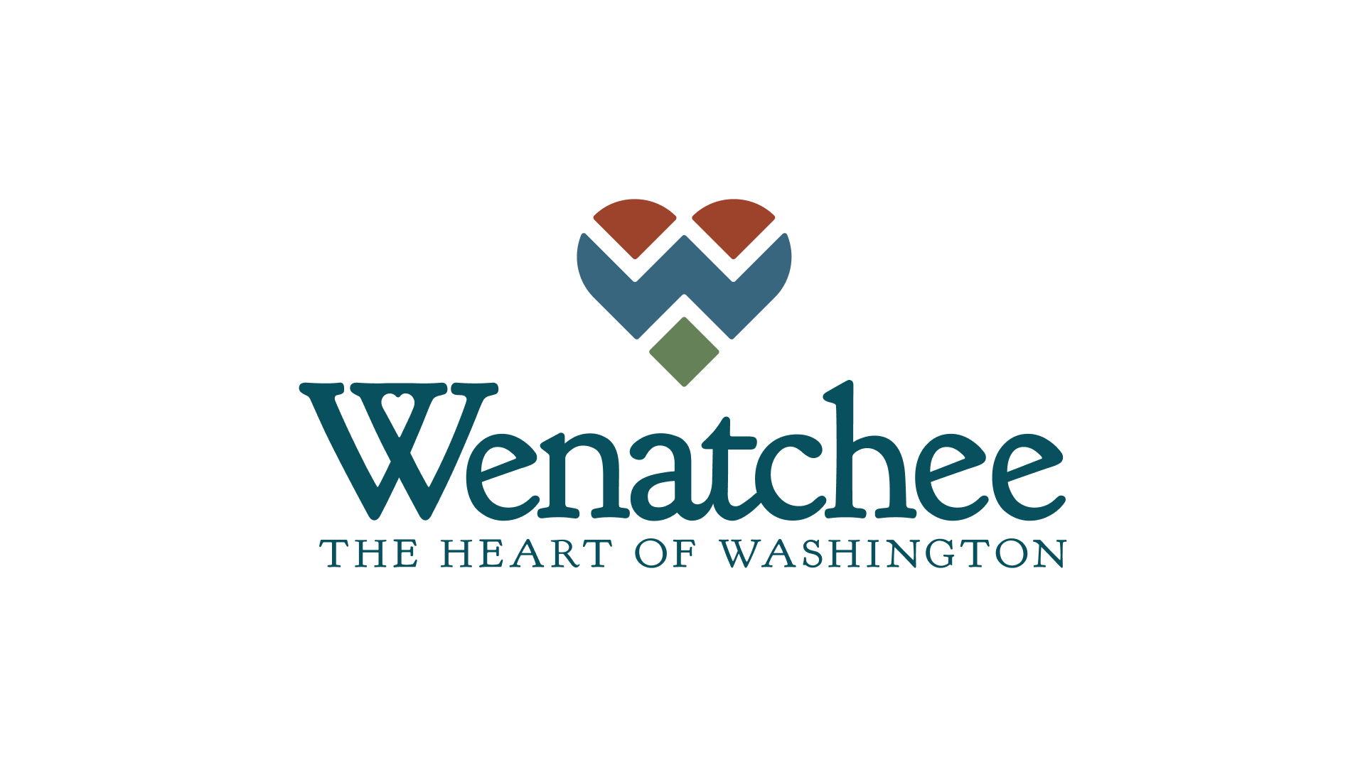
Located at the center of Washington State, Wenatchee has the opportunity to convey its love and bounty of outdoors in one symbol.
Two cone-like shapes construct the top and first layer of the heart representing the mighty mountains and rolling hills. These shapes are a brownish-red color in full color instances of the logo.
A zig-zag shape rifts through the middle of the heart representing the rivers and aquatic bodies running through the region's veins. This shape doubles as a “W”, adding another layer of meaning as this letter is in the “heart” of the heart symbol itself. This shape is a blue color in full color instances of the logo.
A diamond shape at the bottom of the heart supports the heart symbol, representing the parks, fields, gardens, and lands throughout Wenatchee. This shape is a green color in full color instances of the logo.
The Results
- 92% increase is traffic sessions
- 94% increase in engagement time
- 83% increase in subscribers
- 160% increase in email click rates